Google makes PlayStore's “My Appsâ€section more detailed

Google has recently released an updated PlayStore for all Android devices. The latest update overhauls the My Apps section of the store, which intends to make app management easier. The build version of the update is 7.6.08. If you haven’t got the update yet, just head to PlayStore>Settings and tap on the build version to update.
So, why are we putting emphasis on a simple visual update of the PlayStore app? Because the update makes managing the apps on your device a tad easy and helps you save data costs as well.
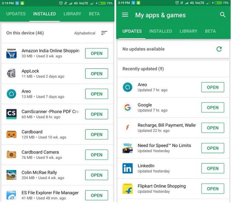
First of all, Google has revamped the tabs section. Now you get four tabs instead of the two – Updates, Installed, Library and Beta.
The Updates tab shows all the apps that have an update pending. The apps are listed as horizontal cards and they show details such as available updates, when they were rolled out by developers, most recently updated apps, and when they received updates. Apps with the most recent available updates are displayed at the top. You can also see how much data consumption an individual app update will take.
The “Installed” tab shows all the apps that are installed on the device. There are now options available to arrange the app list by name, last updated, by size and last used. The last few options can help you manage space on your device efficiently, especially if your phone doesn’t have an expandable storage.
The “All” tab has been renamed as “Library”. Here, nothing has changed, apart from the card based layout. However, an “install” button has been added to each app tile in case you want to install the app back on your device.
The “Beta” tab, that lists all those apps that you are trying as a beta tester, has been left untouched.
Overall, the update has made an impactful change that can add more value to the Android ecosystem on every device.


