Raise the bar
Saniya Kantawala found herself drawn towards design right at the age of seven. She found herself making excuses to visit her aunt’s home, not to play with her cousins, but to stay in “that beautiful home”. Coming from a family of chartered accountants and lawyers, her professional path was pretty much carved out. However, she found her calling when she got the chance to intern under celebrated architect Ashiesh Shah.
Saniya says, “Ashiesh and my mother were training in fitness together at that time. He gave me the chance to work with his firm and understand the industry.” It was this stint that changed her mind about her vocation. After pursuing a Bachelor’s Degree in Commerce, she immediately took up a course in interior design. She continued pursuing design as a vocation as she studied its nuances. “By the time I graduated, I had three-and-a-half years of work experience in my field. In fact, my first solo project was my boss’ residence itself,” she beams proudly.
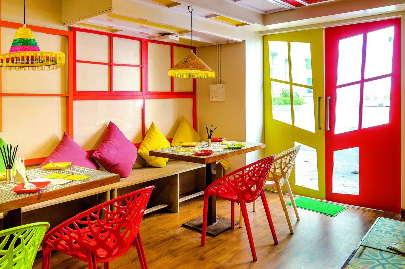
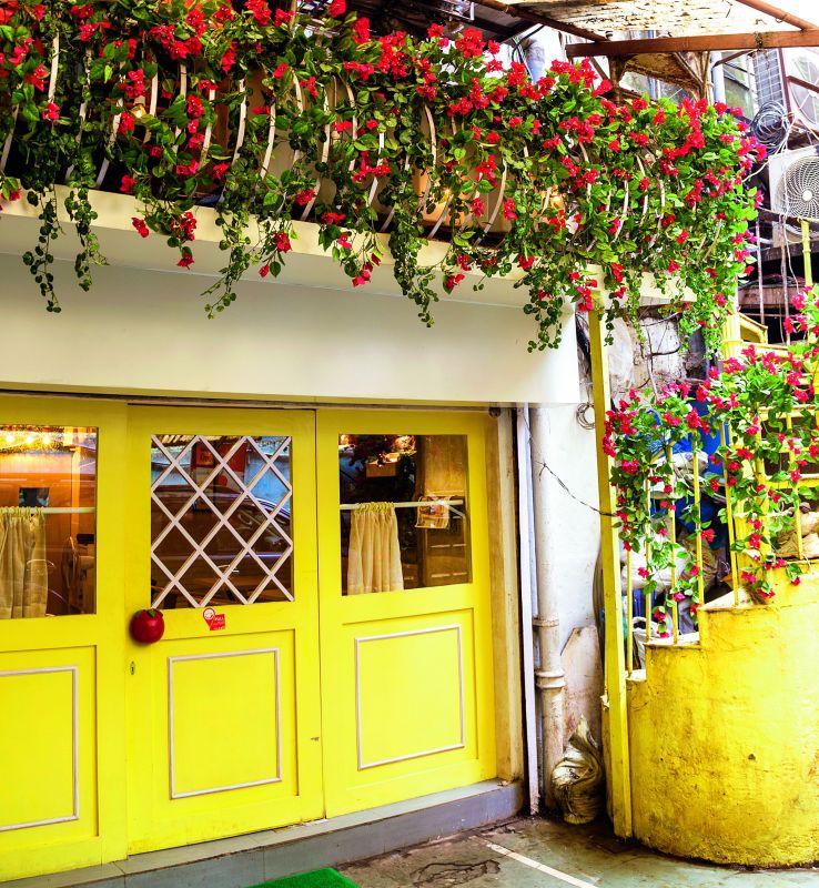
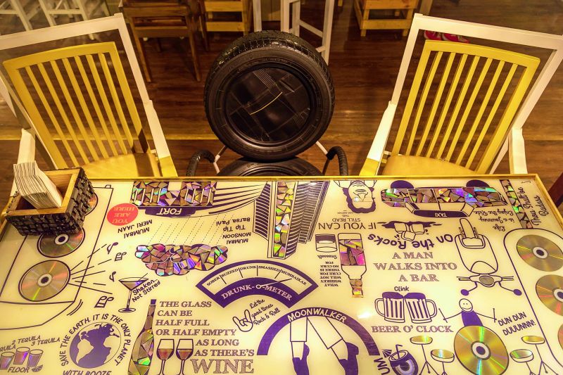
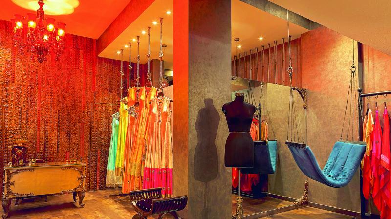
In 2013, she set up her design firm, Saniya Kantawala Design. Today, she has gone on to design for hospitality spaces like The Bar Terminal, Asado, Loco Chino, Francesco and The Terrace, and fashion boutiques for Yogita Kadan and Maki Oh, among others. The Bar Terminal is among her list of important projects that received a lot of attention for its eco-friendly approach. Every element in the pub, be it furniture, lighting or wall décor are created from upcycled objects. So the tables are made with recycled wood, while accessories made with CDs, beer bottle caps, car nameplates and keys find a place on the table.
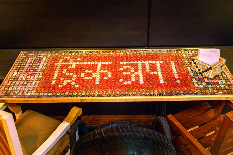 Interiors of the upcycled restaurant
She says, “We didn’t want to use recycled material for the heck of it and then overwhelm the diner. So we used materials that the diner will be familiar with.” Saniya admits that working with an eco-friendly design is much more difficult than it looked. “I realised that working with recycled products is not the same as designing with usual materials. For this project, I would say we had to work backwards — we decided on the object and work on which recycled material could work as the perfect element,” she explains. Tadao Ando and Frank Gerry are two architects who have inspired Saniya towards having a minimalist approach towards design.
The Church of Light in Japan by Tadao remains her favourite work. Light enters from a cross cut in the concrete wall that extends vertically from the floor to the ceiling, and horizontally from wall to wall, to create a cross. “I like the dual nature that he presents in his works — in this case, light and dark.” Saniya is, however, wary of consciously creating her design stamp. “Our mind is a gifted tool, which runs into so many layers of endless visuals, then why limit ourselves to a particular style?” she questions. Saniya compares designing a space to writing a book. She says, “It always starts out with a concept. Every progress made in a project is like finishing a chapter and when the design it complete, it all adds up, much like a book. It is immensely satisfying to see the designs in your mind come to life.”

