Google Maps gets a new User Interface and more
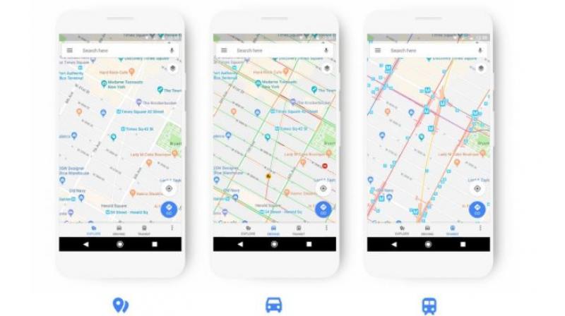
Google has updated the driving, navigation, transit and explores maps to better highlight the information most relevant to each experience.

Search engine giant, Google has initiated a design change in one of the company’s most used application — Maps. The company has redesigned the user interface of the Google Maps app.
Google has updated the driving, navigation, transit and explores maps to better highlight the information most relevant to each experience. The update brings newly designed colour scheme and adds new icons to help users quickly identify exactly what kind of a point of interest they are looking at.
Places like a cafe, church, museum or hospital will have a designated colour and icon, which makes it easy to find that type of destinations on the map. For example, if you’re in a new neighbourhood and searching for a coffee shop, you could open the map to find the nearest orange icon.
Apart from these changes, Google has also done certain under the hood improvements to get the app rid of various bugs. The changes will also be implemented in the website version of Google Maps in the coming weeks. If you are still seeing no changes in Google maps, then don’t fret.
As with all Google app updates, the new version will be gradually rolled out to users across the globe and all you have to do is keep checking for updates from the Google PlayStore.

