Vivo V11 Pro review: Innovative, all rounder, glamorous
The smartphone industry is seeing a decline in innovation in the recent times. Unique products with industry-first features are only available from elite brands at eye-watering prices. The midrange segment hardly gets to see anything new and keeps on borrowing year-old features with compromised performance. However, Chinese behemoth BKK Electronics has been actively pushing newer trends to the affordable segments in the recent times through its prominent OPPO and Vivo brands. In the Q3 2018, they have come up another trendy feature that will be adopted widely by the industry in the coming months — a tiny display notch. OPPO introduced it with the F9 Pro and Vivo has refined it further with its latest V11 Pro midranger.
With a close-to-true fullscreen display, an in-display fingerprint sensor and premium aesthetics, it comes across as a highly tempting smartphone, especially when you consider the price of Rs 25,990. Does this mean Vivo has a winner on its hands to decimate the competition?
Aesthetics, Design:
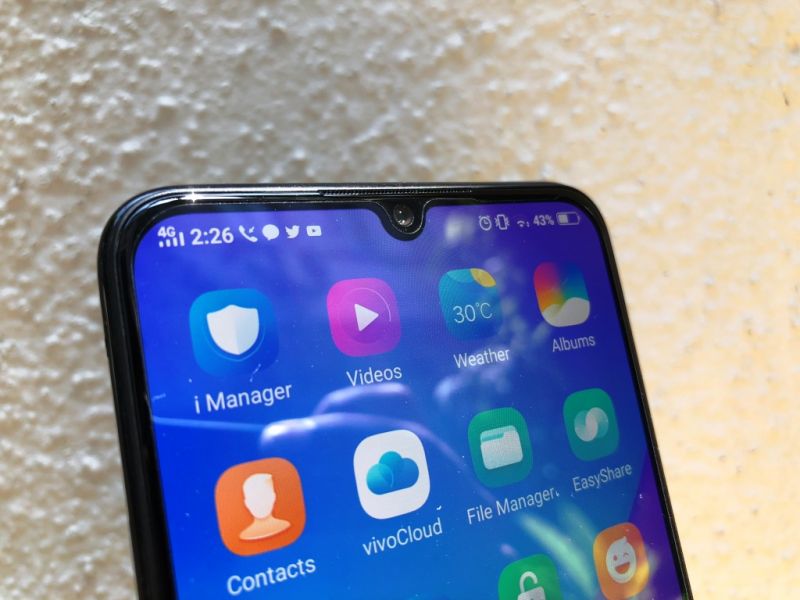
Manufacturers rapidly adopted the notch design trend in 2018, which made most phones end up with sizeable intrusions on displays. On the NEX and FindX, Vivo and OPPO achieved a true fullscreen display through a mechanical pop-up camera. However, the mechanical setup was expensive to implement on a mass market product and it brought along with itself concerns regarding reliability. Therefore, the only other cheaper and robust solution was going for a display with a smaller notch. Hence, OPPO/Vivo (probably) scratched their heads and came out with the water drop style notch, which liberated more space for the screen. Vivo terms it as a Halo notch.
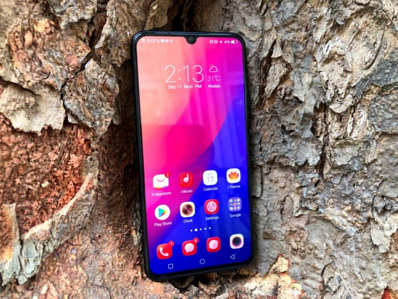
The V11 Pro’s display has extremely thin bezels to the sides and a slim chin. With the Halo notch, the top bezels also appear to be pretty slim. However, if you look closely, you will see that the face has been packaged in a way that hides most of the bezels very cleverly. With the smaller notch only accommodating the front camera, the earpiece sits between the top bezel and the display, with other sensors — including the IR sensors for Face Unlock — being stuffed cleverly along the edges. The curved frame also accommodates most of the bulk, thereby giving the sense of a true bezel-less display. Overall, Vivo has made use of the space on the front very efficiently, which makes for a very futuristic-looking smartphone. Well done Vivo!
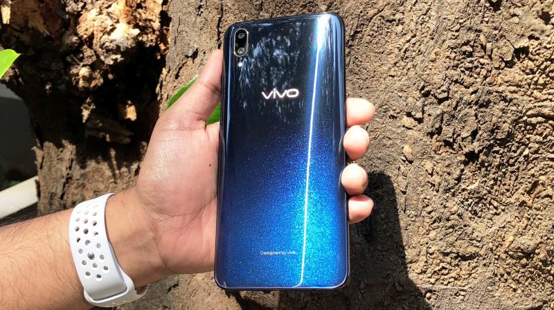
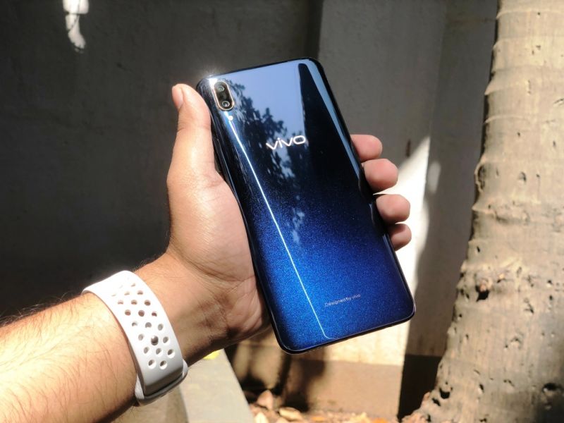
Move over to the rear and you will find a very familiar design from the X21 and the NEX. Like the NEX, the V11 Pro goes for a very subtle gradient finish. The Starry Night variant has a gradient that goes from dark blue to a lighter shade of blue that shimmers when held at an angle. However, unlike the NEX, the rear panel isn’t made of glass — it’s a plastic panel that emulates a glossy glass-like finish. In fact, the V11 Pro has a plastic frame that emulates a metal surface. A positive side to this is a lightweight body that’s easier on the hands as compared to a glass-metal sandwich. The glossy finish is still prone to scratches, which is why Vivo bundles a protective case in the box.
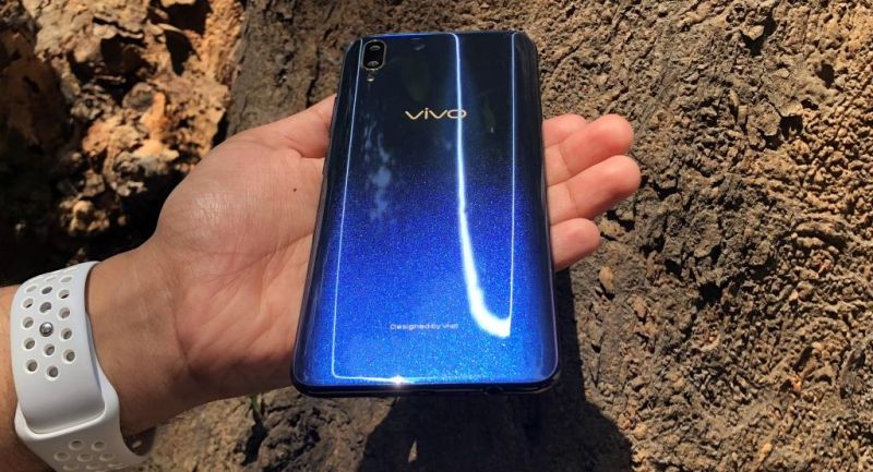


Vivo has retained the 3.5mm audio jack, but hasn’t moved to a USB-C port. The V11 Pro still relies on the old and pesky micro USB port that’s harder to use while plugging in the charger. With rivals offering USB-C as standard in this segment, Vivo should have made the switch to the newer standard.
Display:
The major reason you will really consider the V11 Pro is for its display — a massive 6.4-inch full HD+ AMOLED panel with an aspect ratio of 19.5:9 and an 85.2 per cent screen-to-body ratio. With a small notch only housing the front camera, the V11 Pro’s display liberates a lot of space for the content. The tiny notch aids for an immersive viewing experience, never disturbing the field of view. Even when you are playing games, the notch barely creates a hindrance, thereby fitting most elements easily on the screen. However, the extremely curved corners do eat into the content, which requires developers to optimise their games for the new displays.

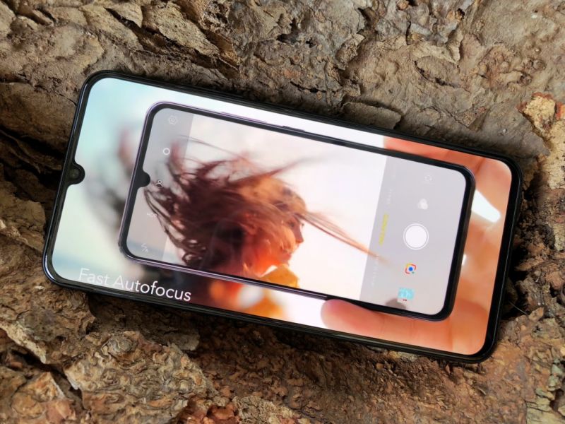
AMOLED panels are known for deep blacks and eye-popping colours, and the V11 Pro’s doesn’t budge from these characteristics. The dynamic range is good, and contrasts are high, resulting in a satisfying experience. The viewing angles are wide as well and sunlight legibility is decent for an AMOLED panel.
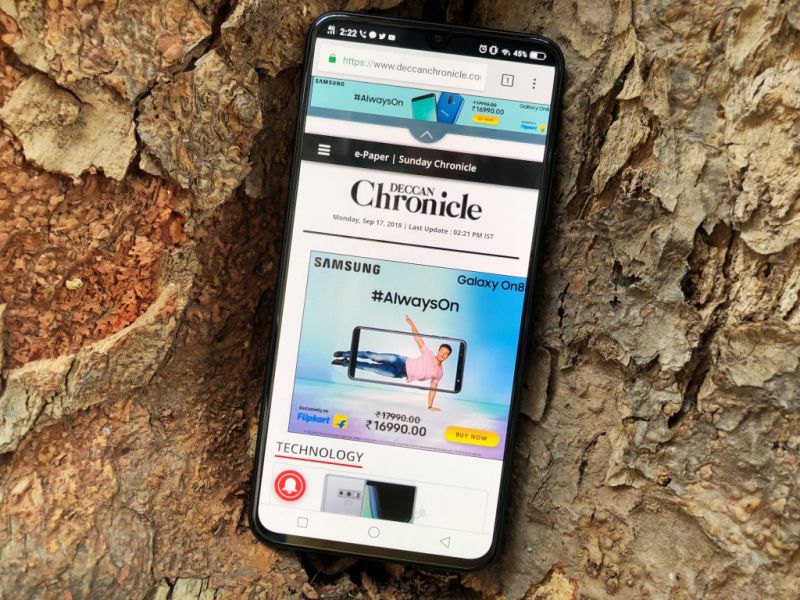
However, the AMOLED panel is only there because of the in-display fingerprint sensor. In its fourth generation, the optical sensor has massively improved from the previous versions in terms of speed and accuracy. The display lights up the patch over the sensor in the lock screen and once you tap on it, it throws a bright neon light for the sensor to ‘see your fingertip’ and authenticate. The new sensor is really fast, with speeds on par with capacitive sensors. In short, you can now comfortable rely on the in-display fingerprint sensor throughout a busy day to unlock your phone. However, Vivo could have linked haptic feedback with the authentication process, which could have made for a more satisfying experience.
Performance:
Unlike the NEX, the V11 Pro is a midrange smartphone. Therefore, Vivo had to compromise on the internals. There’s a Qualcomm Snapdragon 660 chip crunching data, aided by 6GB of RAM and 64GB of storage, which is expandable up to 256GB. The SD660 was a derivative of the SD835 from last year, with eight custom Kryo 260 cores. Qualcomm has already unveiled the SD670 SoC and it would have appealed more if Vivo went for the newer chip on the V11 Pro. Nonetheless, the SD660 is a reasonably powerful chip known to be capable of handling daily tasks without breaking a sweat.
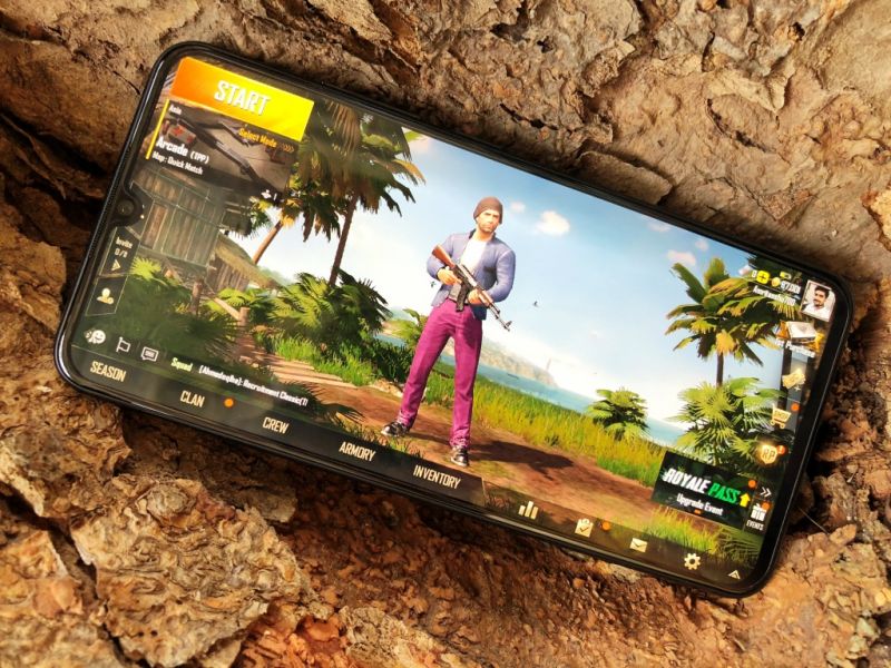
Vivo’s extremely customisable FunTouch OS is present as always — this time it’s based on Android 8.1 Oreo. The OS has been optimised well, which results in a mostly stutter free user experience in daily usage scenarios. Apps respond quickly and multitasking between a bunch of apps is a no-brainer.
However, memory management isn’t impressive, considering the phone can only hold up to four apps at most times — this is an issue that has been ever-present on FunTouch OS. The SD660 can also hold up well when it comes to graphics-intensive titles, provided you tweak the graphical settings to medium/low.
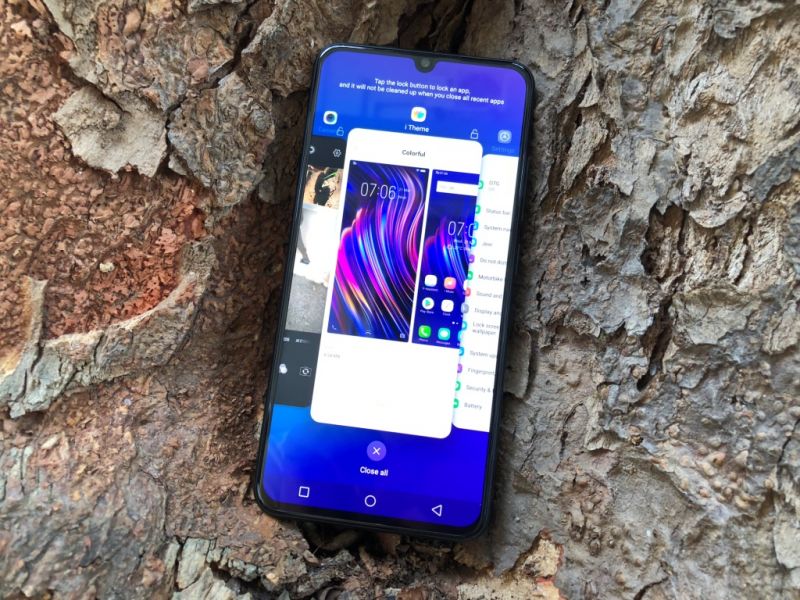
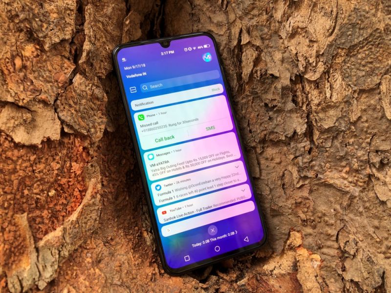
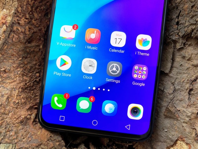
However, FunTouch OS is polarising, i.e. it can be extremely appealing to those who love customising their phone to the heart’s content or revolting to those who prefer functionality over aesthetics. FunTouch OS reminds heavily of older iOS versions — there’s a Control Centre, an iOS-style Notification Centre, an iOS-inspired homescreen, several iOS-inspired apps such as iMusic and iManager, and more. If you have an affinity for iOS’ aesthetics, then FunTouch will be appealing. However, the aesthetics aren’t refined enough — the icons are ungainly, and text often flows out of boxes.
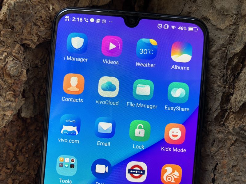
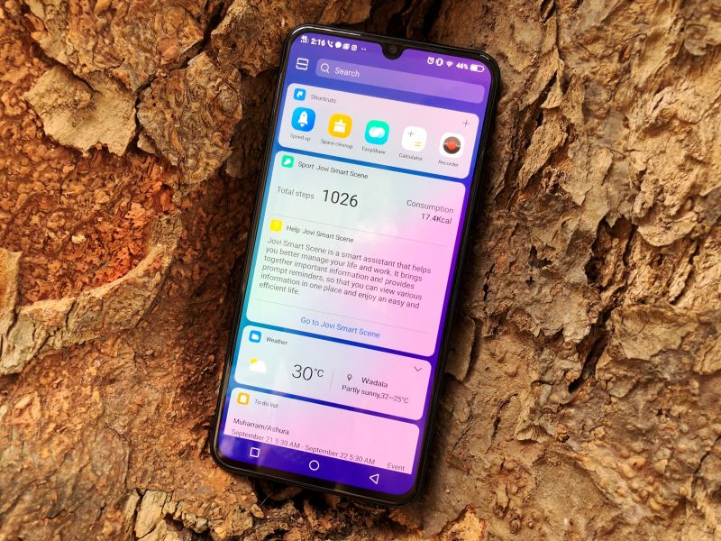
And weirdly, despite sensible upgrades to the hardware side, we haven’t seen a search bar in the Settings menu yet — it becomes a struggle to search for an option, especially if you are used to Android’s default layout in most other smartphones. Vivo’s Jovi AI makes an appearance, with a sole job to learn which apps you use the most and make usual weather suggestions — we found it pointless, given that Google’s more intelligent and proven Assistant is already present.
But what impresses highly is the Infrared Face Unlock system, which works like a charm. The moment you pick up the phone, the system does its work and brings the home screen to you before you can glance at the lock screen. There’s no problem with the dark as well — the IR sensor makes sure the phone can capture your face in the pitch dark.
Camera:
This is where the V11 Pro makes itself appealing. Up front, there’s a 25MP selfie camera while a 12MP+ 5MP dual camera setup takes care of all the point-and-shoot requirements. Selfies have been Vivo’s focus for a while and with V11 Pro, they have taken their game further. The front camera’s image quality is impressive — it snaps with adequate details and a substantial amount of colours in well-lit scenarios. It starts struggling once the lighting deteriorates, throwing up noise and losing details. However, the Backlight HDR feature helps a lot — it uses smart AI algorithms to identify the face and enhance the exposure in that section of the canvas, which eventually makes the subject look brighter. We found this particularly helpful when taking selfies against a light source. The bokeh mode also woks well and beauty mode is suitable for the female consumer (it makes males look unnaturally fair). The AI filters are fun and one can download additional stickers from the menu.
 In Portrait mode with Smart HDR enabled
 In low light with Smart HDR enabled
 Without Backlight HDR. Notice the overexposed sky in the background.
 With Backlight HDR enabled. The background retains the details in the sky and gives more natural colours.
The rear camera’s performance is almost on par, if not better at times, with what the competition offers. In daylight, the photos turn up with a wide dynamic range and high contrasts. Details are present in a reasonable amount. The AI takes things in its hands during low light scenarios by cleverly bumping up the ISO and tweaking other parameters, which makes the photos look good. However, in a situation when the AI fails, noise shows up and there’s nothing you can do to fix the images. The portrait mode works well in most situations, separating the foreground and background through clear edge detection.


The camera can also shoot up to 4K videos at 30fps. The footage quality is just above average and the lack of OIS does pose a challenge to shoots stable videos. What’s interesting is the AI beautification in video, which enhances human faces while shooting.
Battery:
No matter how innovative a phone is, a strong power backup is necessary to make it useable. With a 3400mAh tank, the V11 Pro can stretch it up to an entire day, with some juice left. Incessant texting, lots of calls (including video), short gaming sessions, selfie shootouts, binging on YouTube, streaming music while commuting and social media browsing — if your daily usage is similar to this list, this Vivo won’t need the charger throughout the day. And in case if it does, the bundles 18W adapter will do a quick top-up — you can get it back to 50 per cent from 10 per cent under half an hour.
Conclusion:
As we stated, the midrange segment usually doesn’t see innovative features and Vivo’s V11 Pro is the only one right now that offers novel features. The fullscreen display with narrow bezels and the Halo notch impresses highly and the in-display fingerprints sensor works as intended — you can rely on it for authentication purposes. The camera performance is appreciable as well and so is the performance. An unpleasant point here is the FunTouch UI, which requires a longer learning curve and Vivo seems to be in no mood to fix it. However, the biggest challenge the V11 Pro faces is from Xiaomi’s POCO F1, which offers a flagship Snapdragon 845-class performance and better battery life. So is the V11 Pro pointless?
Absolutely not. If you are looking for a smartphone that’s a breath of fresh air with new features and stylish design while catering to everyday smartphone jobs without hiccups, the V11 Pro fits the description. If raw performance isn’t your concern, then the V11 Pro is a highly recommendable one to opt for in the midrange category.
Click on Deccan Chronicle Technology and Science for the latest news and reviews. Follow us on Facebook, Twitter.

