Vivo V9 review: For those who need a perfect daily driver
The V9 is purely a camera phone with decent internals that works well as a daily runner.
Vivo, the name you just can’t miss — all you need to do it simply look around, wherever you are in this country. The brand has been painting the country blue, charging like a bull with an aggressive approach to beat the competition and grow tall. Though the brand may not be as high as the recent rookies-turned-giants — we are naming Xiaomi and OnePlus — they are definitely ringing bells around and passing by smartphone brands such as OPPO and Gionee. Vivo is soon making a statement in the budget-to-mainstream-level smartphone segment in India. And why not — India being the second largest smartphone market, Chinese brands are playing their cards in the continent which has the highest consumption of smartphones. However, you should know that though the brand is competing for big names in the market, it actually is operated by BBK Electronics, which also owns OPPO and OnePlus. No wonder their smartphones usually resemble similar designs.
The last release of Vivo was the V7, and as usual, all Vivo smartphones are mainly banking on the selfie camera, catering largely to the selfies generation. And now they have launched the Vivo V9, which takes selfies to a new level on a handset with a completely new design package. And yes, this could be claimed as one of the first smartphones that flaunt Apple’s iPhone X-style notch along with its interface and gestures.
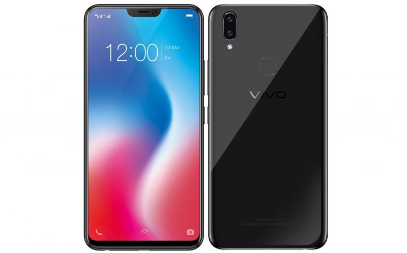
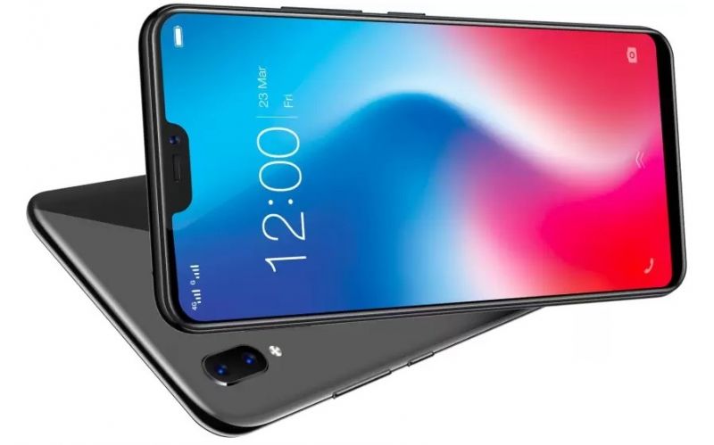
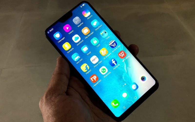
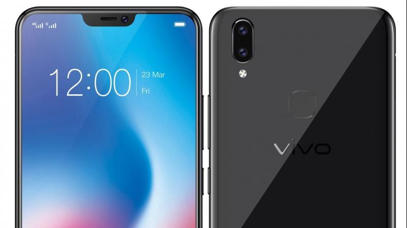
The Vivo V9 we received is an all-black smartphone encased in a shiny glossy and elegant casing. In fact, we had heads turning around in our office at first sight of this handset. The device is sleek and slim unibody and sports an almost bezel-free design (90% screen-to-body ratio). The display is a large 6.3-inch full HD+ IPS panel sporting a resolution of 1080x2280 pixels (400ppi) with a small notch cut out on the top.
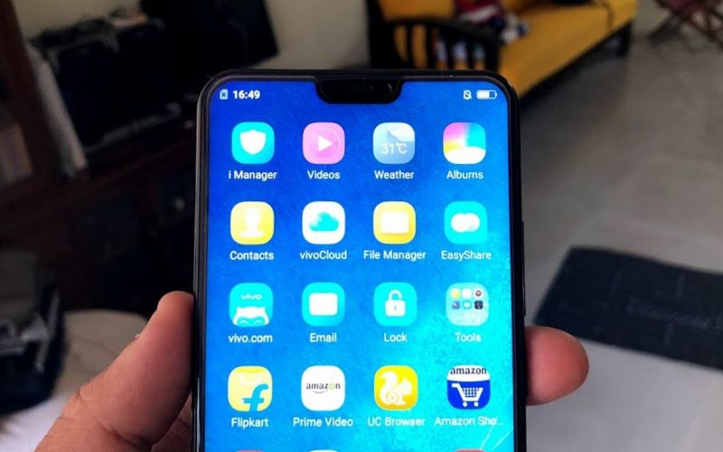
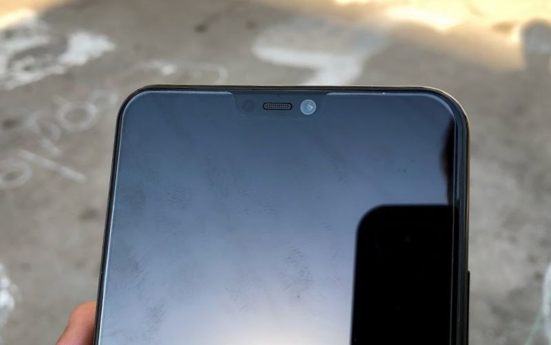
The display is tall, and yet fits in a 5.5-inch-like form factor. Thanks to the notch, the display now has an aspect ratio of 19:9. The notch sports the camera, speaker and a single proximity sensor. Sorry guys — no IR blaster or 3D sensor as yet as they are still expensive and only Apple could probably afford to have the expensive face reading hardware at this point in time.
A noticeable chin (though very thin) is seen on the lower part of the display, which leaves out the only area that does not flaunt the bezelless body like the iPhone X can. All the control buttons are now in the UI itself. No in-display fingerprint reader yet. The display is protected by Gorilla Glass so you won’t see a scratched phone anytime soon. However, the phone does come with an additional protection of a company pre-fitted scratch guard.
Heading on, the sides are rounded but have sharp curves, and do not flush into the display. A raised recess is where the display meets the rear body. The sharp curved edge makes for a good grip, with or without a case. The left edge makes room for the dual SIM and dedicated micro SD card slot, while the right side houses the power and volume rocker buttons.
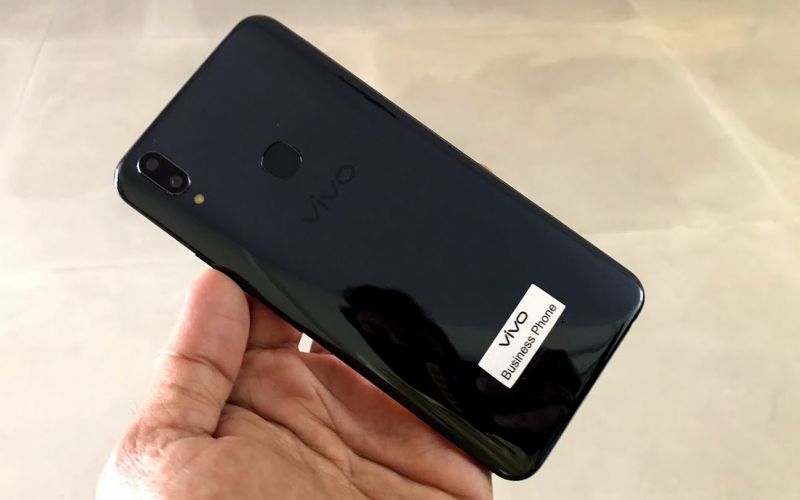
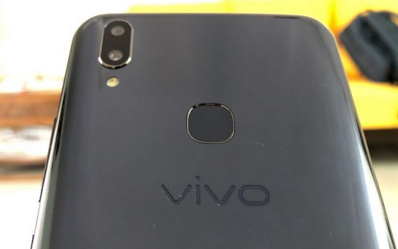
The top is completely left blank, while the bottom sports the micro USB slot (yeah — we too expected a Type C), microphone, speaker and a 3.5-mm headphone jack. The plastic rear panel gets a mirror finish that looks elegant, but sadly, this makes the entire rear panel a fingerprint magnet.
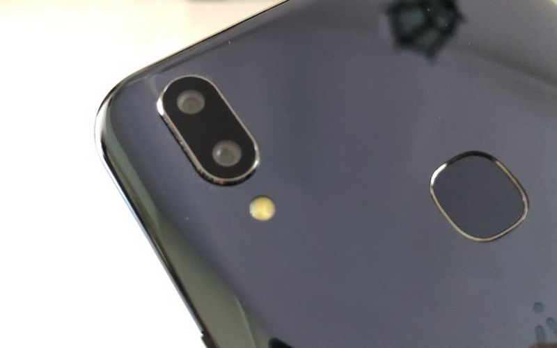
The rear panel sports an iPhone X-like dual camera setup that has a chrome edge and protrudes outwards. Below the cameras is a single LED flash, and towards the centre of the top half is the fingerprint sensor. The bottom part has two protruding buds that help keep the phone’s rear from touching the surface of the table when laid flat. This helps protect the rear panel from scratches that would ruin the looks.
Below the hood is a powerful Snapdragon 626 processor from Qualcomm that is built with 8 Cortex A53 processors clocked at 2.2GHz. Supporting the processor is an Adreno 506 GPU with 4GB of RAM. The storage provided is 64GB, while the card slot that can help you increase the capacity. Yes, the micro SD card slot is dedicated and you can use both the SIM cards with a micro SD card simultaneously — rarely found on most phones at this time.
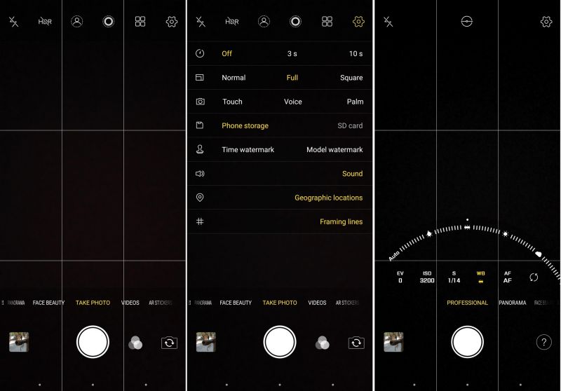
Heading to the imaging department, the Vivo V9 flaunts a selfies camera capped at 24MP that has an aperture of f/2.0 and can capture full HD videos. The rear cameras have a dual sensor setup with one spec’ed 16MP and another at 5MP, both having an aperture value of f/2.0 too. The rear camera can capture videos at 4K resolutions and also sports slow motion capture. Both the rear and front cameras feature portrait mode and face beauty.
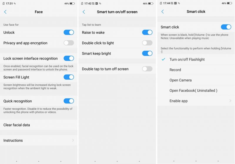
Other specifications of the Vivo V9 include 4G VoLTE, dual-band Wi-Fi, Bluetooth, and USB OTG. Features include Face Recognition, SmartSplit, AR stickers, Android Oreo 8.1 and a few more.
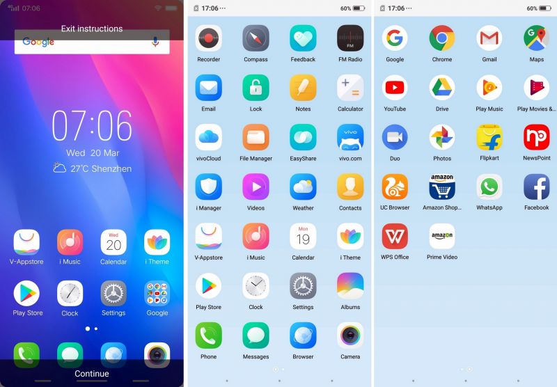
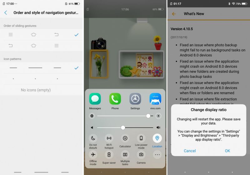
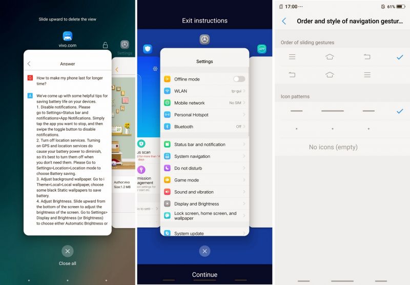
The Vivo V9 sports FunTouch OS, which is almost a replica of Apple’s iOS — but not entirely. However, we must say that the user interface can definitely push you towards experiencing an iPhone X — thanks to the notch and the iPhone X-like home bar-like navigational gestures. No, this one has no bar, but the regular back, menu and home buttons that can be converted into three dots and behave similarly to how iPhone X’s home bar does.
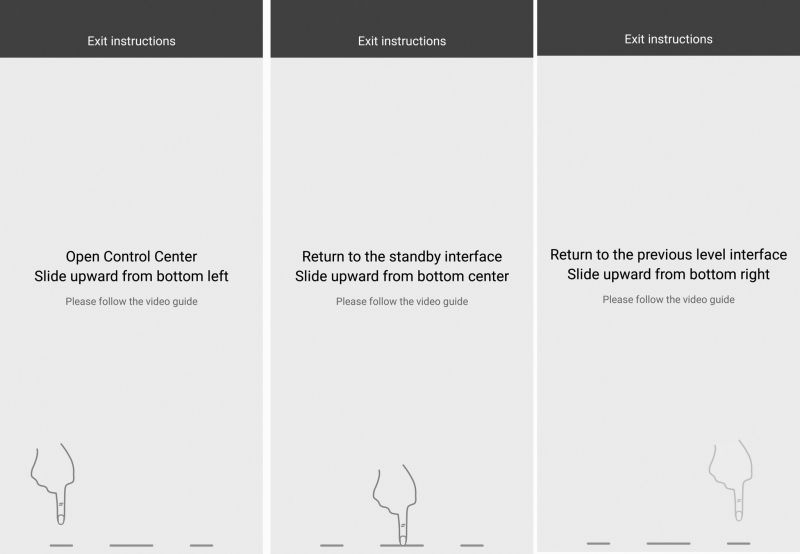
When in gesture mode, the navigation buttons can be placed as dots or be invisible. Swiping upwards on the first dot brings up the control centre from below and the right dot works as a back button. The centre dot is what works as X-like home bar — when swiped up it functions as the home button and when swiped up and held, it brings up the recent apps listing similar to how the iPhone does. Lastly, when you swipe the three buttons from left to right or vice versa, they too work like the home bar to move into the next or previous application (multi-tasking). Missing here is probably swiping down which enables easy one-hand mode — we could expect that too in a future update.
The fingerprint sensor also gets gesture mode — swiping down brings lowers the notification panel and touching it in camera mode can click photos. We hoped to see an option for swiping up on the fingerprint scanner to bring up the control centre but did not find it. Other gestures are also available and can be enabled from the settings menu. These include quick gestures for bringing up desired apps, and also physical button shortcuts can be configured according to user choice.
The entire UI is smooth and sturdy. However, there were a few events when we faced a stutter and lag, but we assume that will soon be refined in new updates later. The Snapdragon 626 processor works well to help with the user interface for a seamless experience.
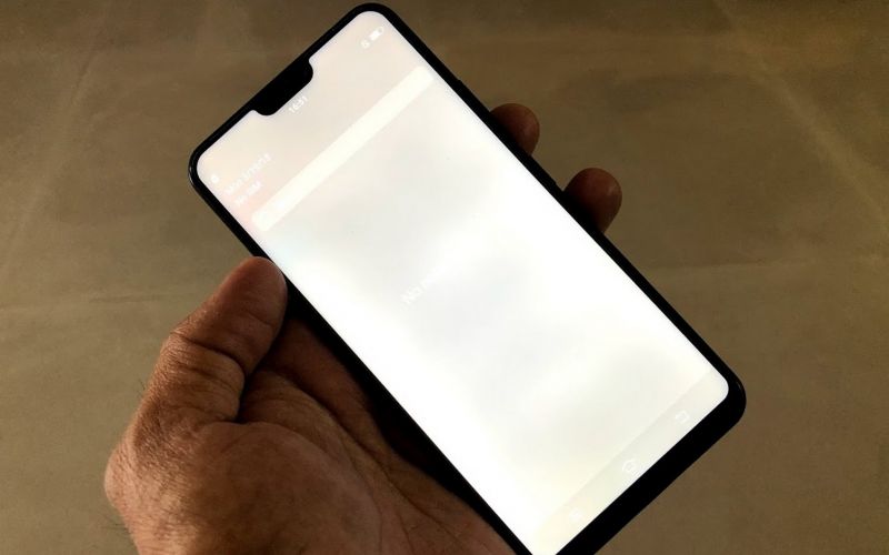
The display is the most important part of the Vivo V9 — a notch cut-out makes it stand apart from conventional full view display smartphones out there. The moment you wake up the phone, the display is something you can relish. The tall display accommodates the notch and the two sides take on the charge of displaying the icons that are usually seen in the notification panel. This additional space created because of the notch leaves you to enjoy a larger real estate on the display. However, since Android Oreo is not optimized for a notch design, the device relies entirely on the FunTouch OS (v4.0) to do the math. The custom OS makes sure that the notification panel and icons stay up there, but can do very little when it comes to individual apps that are not ready for the notch. However, for now, Vivo seems to have done a commendable job of replicating and accommodating the notch area. Vivo calls this new display with a notch and 19:9 ratio as FullView Display 2.0. However, present apps are only scalable up to 18:9 displays and this one being a 19:9 ratio, you will still notice the ugly white or black bars on the top or bottom of the display. Third-party apps (which are almost all apps you download) don't fill up the entire screen. Come Android P and you could be able to see Vivo utilize this display at best.
Overall, the user interface is nice with a good blend of colours and themes along with gestures and features. The IPS display is also crisp and produces vibrant colours. Viewing angles are good, and daylight outdoor visibility is almost unaffected.
As for the performance, we would say that you should not expect too much from the Snapdragon 626. The processor is engineered for power and efficiency with its 14nm technology. This means it can manage a good balance between performance and battery life with the main concentration towards power efficiency. The device performs well but does stutter with a few lags with heavy apps at times. As for heating, you won’t find this baby warming your hands anytime soon unless you tend to bypass its performance withstanding by pushing it to its limits. Though gaming is considerably good enough, this can handle only casual games and we would suggest keeping the heavier titles out unless you are ready to face a few lags and numbers on your battery life.
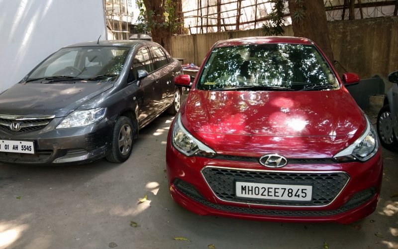
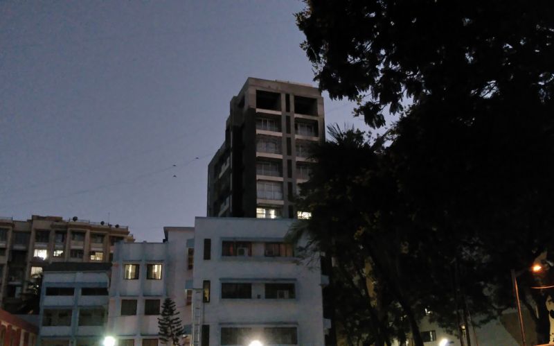
As for this smartphone, the main outstanding feature is its photography strength, and more prominently in the selfies arena. Photos from the rear cam are crisp, clear, sharp and vibrant. The photos do stand out and can compete pretty closely with many rivals who boast of a good camera. The 16MP sensor does manage to produce good results whilst maintaining almost true-to-life colours. The secondary camera is a 5MP, which helps for portrait shots (bokeh mode) and does a fairly good job. However, the bokeh imaging tends to fail in areas that are not in focus. The good part is you can set your own bokeh mode even after the photos are captured. Thanks to the dual camera feature post-processing on the images allow you to choose which area (the subject or the background) you need to keep in focus and which you need to be blurred out. Images shot in broad daylight are excellent and night shots (low light) are above average too. You will find the images a bit noisy as grains settle to a certain extent.
Selfies are great — makes sense as this phone is highly designed for selfies. The 24MP camera up front can produce good self-shots with bright and detailed quality. However, the beautification mode kicks into action and there’s no way you can cut it off. The least amount is 1 on a scale of 1 – 6. And AI (auto beautification relied on AI) is set by default. While the AI mode does a fair job, it still works out well. Sadly, at high, the photos are ruined because it flattens the skin texture completely, making the person look artificial.
Check out some of the photos clicked on the camera below.
As for the battery, the device performs well. If you keep your usage moderate, with casual photography, texting, calls, emails and messaging, you should be running through the entire work day with ease. Throw in a bit more of usages such as videos and gaming, you would be running to your charger at least once more during a work day. However, it depends on the user’s usage and is completely subjective.
To sum up the entire experience, the Vivo V9 is purely a camera phone with internals that works well as a daily runner. Built entirely for selfies and the rear camera, the company has also focused on its design. A new refreshed shiny/glossy back with a notch and gestures that gives Android users a feel of an iPhone X, Vivo seems to have done a good job in order to attract new customers. If photos and music is your requirement, budget is fairly good, style quotient is important and you want to get a feel of an iPhone X, the Vivo V9 is your best bet. At Rs 22,990, we do feel Vivo has placed the Vivo V9 in a competitive category with its rivals.
Click on Deccan Chronicle Technology and Science for the latest news and reviews. Follow us on Facebook, Twitter.

