Vivo NEX review: A blueprint for the future?
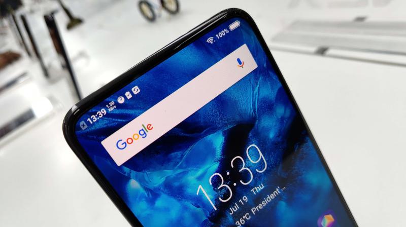
Ever since Xiaomi rolled out the Mi MIX in 2016, the definition of a bezel-less fullscreen smartphone has evolved by leaps and bounds. The initial designs pushed the display as further as it was physically possible, without altering the technology in sensors and earpiece (barring the Mi MIX itself, which went for a piezoelectric speaker). Several established manufacturers, such as Samsung, HTC, OPPO, Vivo, OnePlus and the lot, tried to attain a balanced design with negligible bezels to the sides, a slim chin, as well as no forehead. All that changed when Apple showed off its iPhone X, which introduced the concept of a notch to retain the traditional sensors in the conventional place – the top of the display.
While the rest of the industry has followed the notch, Chinese manufacturers such as OPPO and Vivo have been eager to show design concepts that go closest to the idea of a completely bezel-less display. Vivo introduced the APEX concept earlier this year at the CES and followed it up by spawning a commercial version a few weeks ago – the NEX. Slated to be an example of how the Chinese giant tackled the issue of display notches and noticeable bezels, the NEX has been brought to the Indian market at a rather surprising yet highly competitive price of Rs 44,990, which puts it right under Apple and Samsung' flagships. Vivo has been aggressively marketing the fullscreen display and the pop-up selfie camera (which is undeniably cool), the latter being proudly flaunted as the solution to the notch.
However, it’s the most expensive offering from a brand that’s best known for budget and midrange smartphones, specialising in selfie cameras. Is it then worth to aid your temptation and spend a "flagship" amount of money on something that’s yet unproven? Let’s boot up the NEX.
Design, Aesthetics:
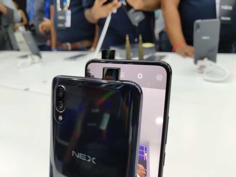
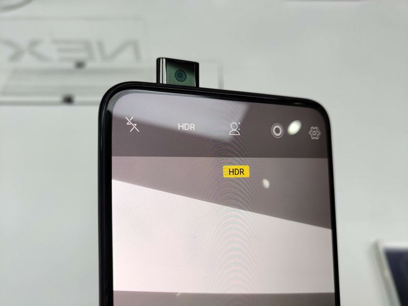
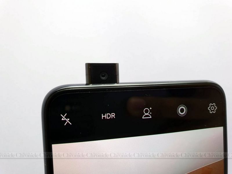
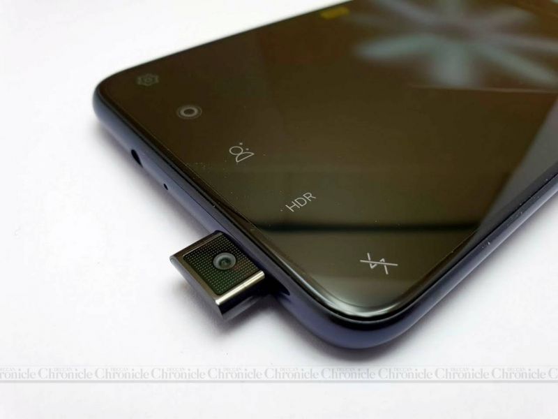
The primary reason you are going through this piece is that you fancy the sliding front camera — well, you're not alone. In fact, when we unpacked the Vivo NEX for the first time, the first thing we immediately did was hit the camera app and switch to selfie mode. No matter how awe-inspiring features Apple and Samsung try to stuff into their flagships, none of them can match the ‘wow-factor’ of the pop-up camera on the NEX.
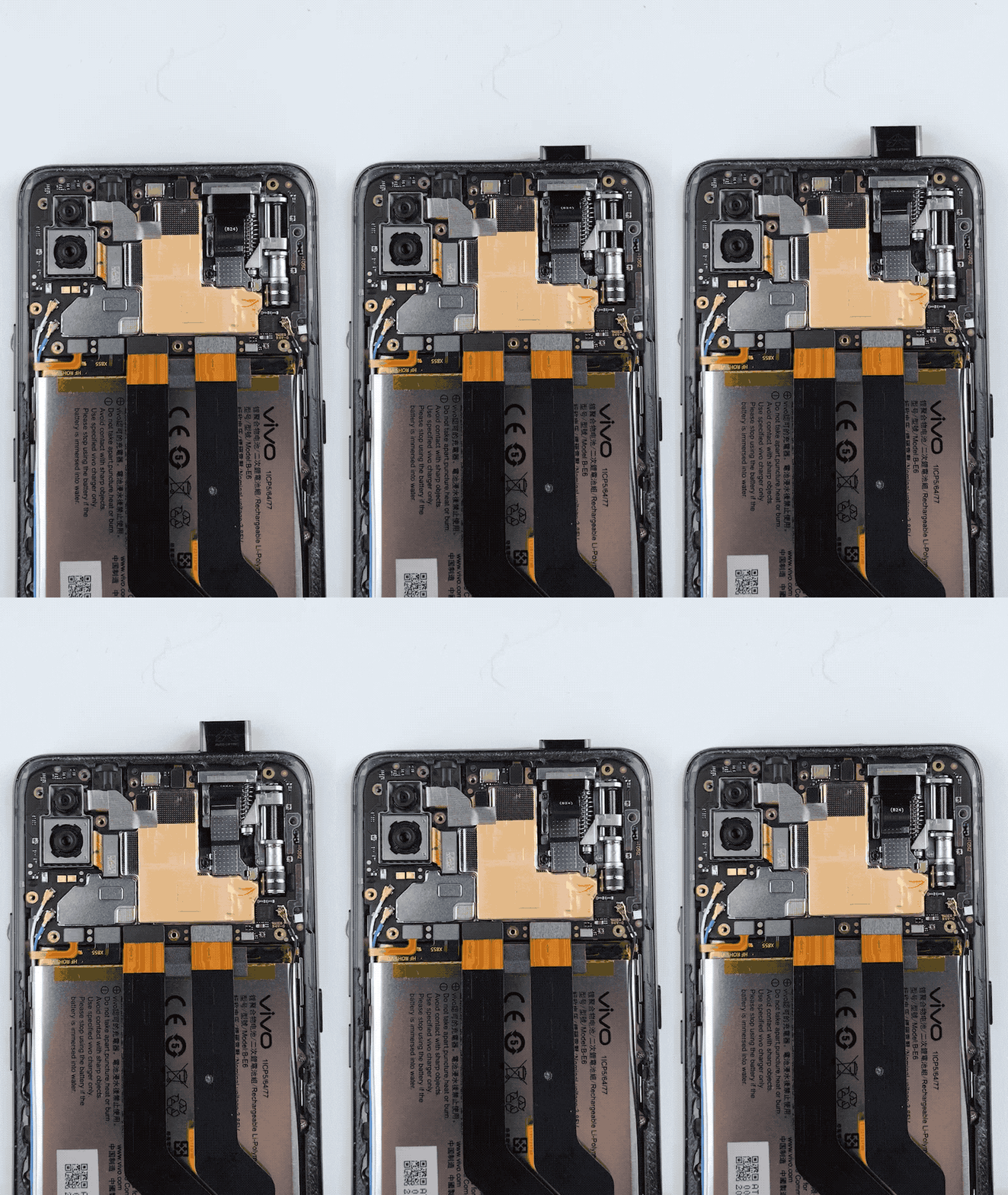 Image: MyFixGuide
The selfie camera takes almost about a second to deploy and be activated, and vice versa. And while the deployment is underway, the NEX plays a futuristic notification through its loudspeaker to enhance the experience, thereby by making it a phenomenon every time you flip to selfie mode. However, you can also change the sound from three preloaded options – after all, Vivo feels that the pop-up camera should appeal to all kinds of users.
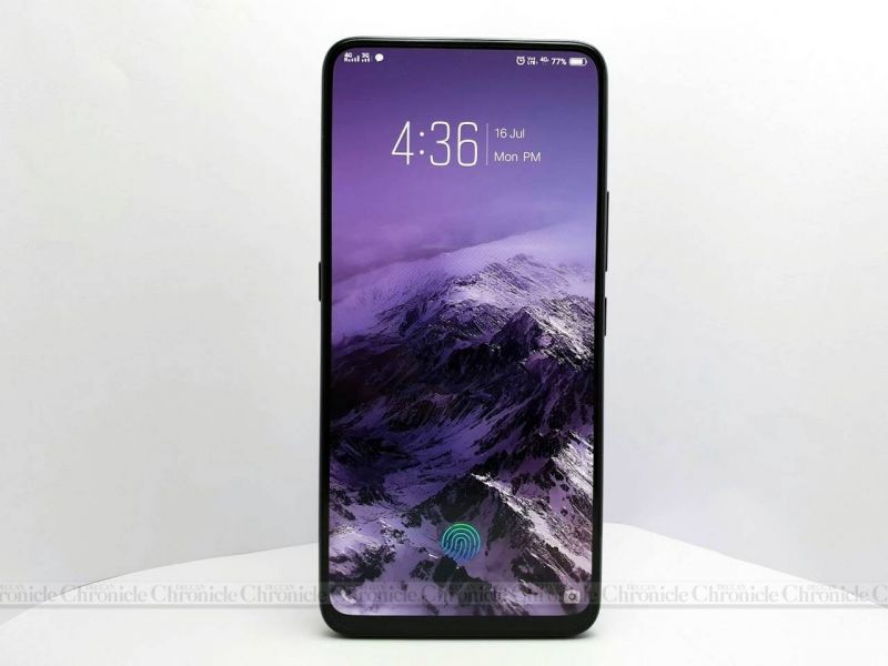
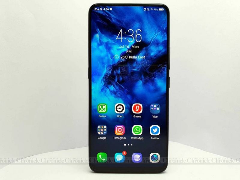
Once you have taken in enough of the selfie pop-up camera, the rest of the NEX’s aesthetic elements come into their own to keep you busy admiring it. To the naked eye, it appears as a slab of glass resting on your palm – thanks to the absence of any visible earpiece, the front camera and the usual host of sensors. But where did all those important elements vanish?
While it was possible to relocate the camera on a hidden sliding mechanism, the same couldn’t be done for the sensors and earpiece (unless they went the OPPO Find X way of making the whole top-end a sliding panel). Vivo neatly hid them underneath the display.
The proximity sensor on the NEX uses ultrasonic signals to detect obstacles – the waves can penetrate the display layer, making it possible for Vivo to place it underneath the screen. The ambient light sensor works similarly too, sitting tight under the top edge of the display. Both work effectively, with no anomaly being thrown up during our time with the NEX.
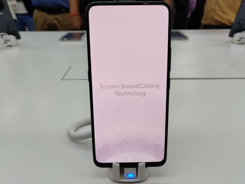
Things get interesting with the earpiece which works in a similar fashion seen on Xiaomi's Mi MIX. There’s a special vibrating mechanism (similar to Apple's taptic engine) sitting underneath the display, which works as the speaker. This mechanism radiates the sound to the display using vibrations, thus making it audible to the human ear. Therefore, the entire top half of the display emits sound. In fact, the vibration is loud enough and emits sound through the rear panels too (albeit faintly), but not loud enough to broadcast your conversation to your neighbours. Vivo calls this the Sound Casting technology and we were surely impressed by it.
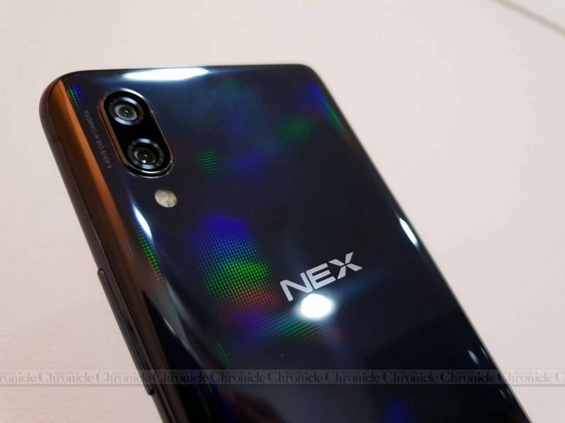
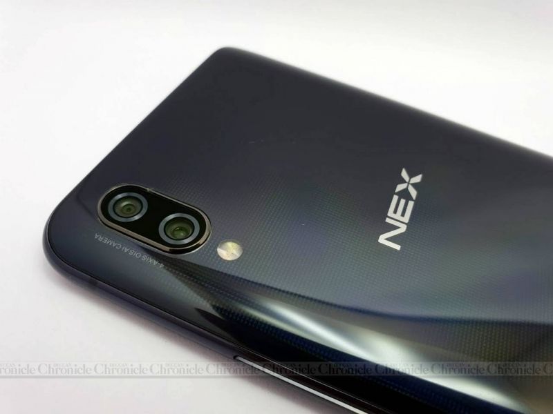
Turn around to the rear and you will find it rather bland in comparison to the magnificence that the front of the device exhibits. The layout is familiar to what you see on most smartphones — with a dual camera setup stacked vertically into the one corner. However, hold it an angle and notice carefully – you will find the NEX’s rear panel emit a rainbow-like shimmer – thanks to the laser-etched surface. Curious eyes will also notice the NEX logo takes utmost prominence, with the ‘Designed by Vivo’ logo taking second priority – it seems that Vivo really wants the NEX to establish a brand on its own.
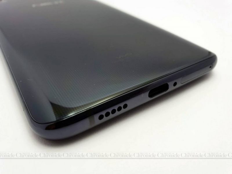
One more point to notice is the presence of a USB-C port – a first for a Vivo smartphone. While the rest of the usual elements, such as the loudspeaker, the volume/power buttons and the dual SIM card tray, are present, the NEX features a discrete AI assistant button. Yes, there’s a voice-assisted assistant by the name of Jovi, and Vivo gives it a dedicated button for operation. This seems to be heavily inspired by Samsung’s implementation of the Bixby button on its flagship. Sadly, Jovi is presently limited to conversations in Chinese, which is why the global variant of the NEX doesn’t feature it. Instead, Vivo uses the ‘AI button’ to trigger Google Lens and Google Assistant. And yes, you can disable it from the settings if you keep depressing it accidentally.
However, not all is well with the Vivo NEX’s build. At 199 grams, the weight of the phone is certainly noticeable, especially when you are using it while lying down. Then there’s the pop-up camera, which while being cool and an intelligent idea, brings in moving mechanical parts to a smartphone — moving parts are not safe from dirt and moisture, and hence the NEX loses out on water and dust resistance. So make sure the NEX never experiences the rain. And although Vivo claims that the sliding mechanism’s life is up to 50,000 times, the doubt about that is high enough, considering the NEX has to go through curious handlers marvelling the pop-up camera mechanism.
Display:
The NEX was born to deliver a perfect viewing experience. With the absence of a notch and an extremely slim chin, the display does manage to deliver an immersive viewing experience. At 6.5-inches, it’s one of the biggest screens slapped on a flagship. Add to that an AMOLED panel and it only gets better. The display renders sharp images with vibrant colours and contrasts. The viewing angles are wide and sunlight legibility is also decent.
If you are wondering whether all the extra functions (emitting audio and hiding all the other ultrasonic sensors) that the display has to do affects the viewing experience, it will be worthwhile to know that it doesn’t. It looks and feels like a normal display, albeit with no bezels around it. The in-display fingerprint sensor, which we last saw on the Vivo X21, is also featured here, and now works better. Vivo is using a third-generation sensor, which promises to reduce scanning time and improve accuracy. In the real world, compared to the sensor on the Vivo X21, the speeds are only slightly faster while accuracy levels have noticeably improved. The sensor is still slower than capacitive variants, but one can live with it for now. And for added convenience, the patch above the fingerprint sensor lights up on the Always-On Display, when the device detects motion.
Also read: Vivo X21 review
Performance:
In order to give the NEX bragging rights as a first-generation product, Vivo has included all the best hardware it could find in the market. Therefore, Qualcomm’s latest Snapdragon 845 chip is doing processing duties underneath with the help of 8GB of RAM and 128GB of onboard storage. Vivo’s FunTouch OS 4.0 looks after the user's errands, which is based on Android 8.1 Oreo.
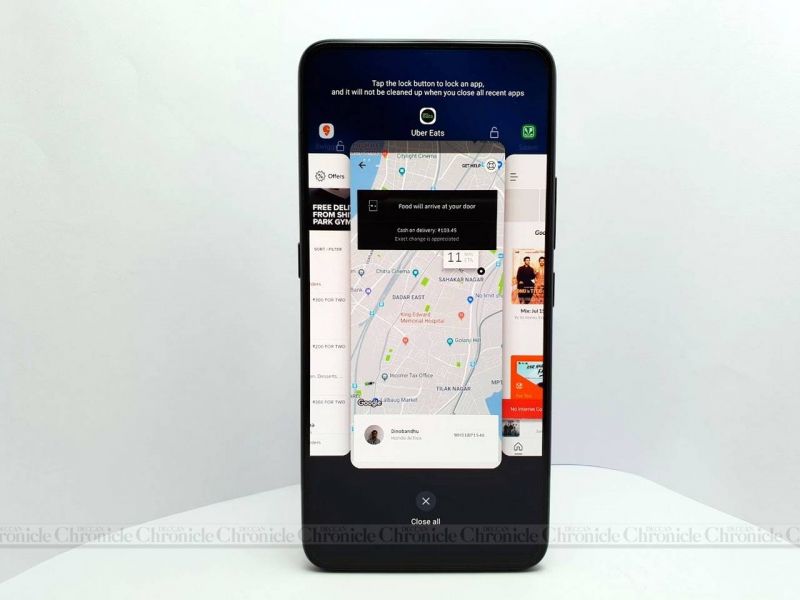
With such potent internals, the NEX is easily one of the quickest smartphones we have seen in 2018. Whether you are shuffling between apps or killing time on resource-intensive games, the NEX makes sure the experience is delivered as intended – no lags, no stutters, no frame drops. However, memory management isn’t the best we have seen on a phone of this class – the NEX can only hold up to four apps in memory, despite the presence of 8GB of RAM. Vivo should fix it with a future software update.
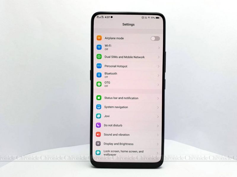
Vivo’s extensively customised FunTouch OS is by far the least ‘Android-ey’ interface we have ever seen – the UI reminds us a lot of Apple's iOS. The notification shade only displays notifications while the control centre, which can be pulled up from the bottom, contains all the toggles, shortcuts and recently used apps. Dig into the Settings and it takes a lot of time to figure out what’s where (sadly, there’s no search function in the settings). Additionally, Vivo also pre-loads the NEX with a lot of its own apps, most of which cannot be removed. And since there’s no app drawer, most of it cannot be hidden as well.
That said, FunTouch OS does manage to deliver a unique experience, with several AI-based nifty features. You can get rid of the navigation buttons and rely on iOS-like navigation gestures, which work efficiently. Then there are features such as Smart wake, Smart call, Smart turn on/off, Air Unlock and many more, all of which make it easier to use the NEX. Customisation freaks can also choose from various themes, fonts and wallpapers.
Whether FunTouch OS will appeal or not depends largely on personal preference. If you prefer an iOS look and feel with the conveniences of Android, the FunTouch OS will keep you happy. But, if you are a die-hard stock Android interface fan, we suggest you install a third-party launcher for a pleasant experience.
Camera:
In the past, Vivo smartphones have been known to deliver appreciable imaging capabilities and the NEX is no exception. On the rear, there’s a 12MP primary sensor with f/1.8 aperture, a 1/2.5-inch sensor with 1.4µm pixels and assisted by 4-axis Optical Image Stabilisation. The secondary 5MP sensor with an aperture of f/2.4 is used for collecting depth information.
The setup manages to capture good-looking photos in daylight situations – photos exhibit vibrant colours and contrasts, albeit average levels of details. The vivid colours and contrast are primarily due to AI algorithms, which alter the camera parameters based on the scene and the subject to get the best results. Therefore, by default, photos turn out to be enhanced and edited. When it comes to low-light photography, the NEX struggles to maintain its capabilities. The AI algorithms unnecessarily bump up the ISO ratings, which while improving visibility in low light, also brings in loads of noise. The only solution to lower the noise is tone down the exposure manually to get desirable shots in such conditions. This may turn off those who prefer natural photography, but it will appease shutterbugs who spend most of their time uploading their snaps in Instagram or Facebook.
As for videos, NEX can shoot up to 4K videos @30fps along with slow-motion shooting too. The presence of OIS results in stable video footages. What’s surprising is that Vivo’s Face Beauty mode is also available while shooting videos, thereby enhancing human subjects in videos without any manual post-processing required.
As for the front 8MP pop-up camera, the imaging abilities can at best be described as on par with midrange offerings. Selfies look good in brightly-lit conditions whereas low-light situations result in noise. The images also tend to lose out on sharpness, especially in low light scenes, which is unlikely for a Vivo smartphone. Weirdly, there’s no portrait mode for selfies. The facial recognition system has also been avoided for reasons unknown to the world – maybe Vivo was worried about the lifecycle of the sliding mechanism system. Vivo should deliver improvements in this regards with a future software update. Additionally, do note that the front camera takes almost a second to get activated due to the sliding mechanism.
Battery:
The Vivo NEX features a huge 4000mAh battery. Combined with the power-efficient Snapdragon 845 chip, the NEX manages to deliver an almost full-day stamina. On an average usage cycle, which involves audio and video streaming, online gaming sessions, incessant texting, occasional photography and web surfing, the NEX manages to last almost 24 hours, before the battery indicator goes red. And when it goes red, the bundled 22W fast charger will top up the battery quickly – our observation saw the battery percentage go from 50 per cent to a full tank in under 40 minutes.
Conclusion:
Within a span of six months, Vivo has turned a concept device into a mass-market product – kudos to Vivo for that. What’s even more impressive is that the NEX seldom feels like a first-generation concept-based product – it feels no different to use than a Samsung Galaxy flagship. Despite sporting a mechanical moving component, the NEX comes across a well-built and desirable smartphone. Along with the OPPO Find X, it is presently the only smartphone that offers an unhindered true fullscreen display experience with negligible bezels. Factor in the flagship performance and decent photography capabilities, and the NEX comes across as a great all-rounder as well.
Should you spend Rs 44,990 for the Vivo NEX? If you have the moolah — then definitely! The NEX is a whiff of fresh air in the conventional flagship smartphone category, which is full of dull offerings that look identical. Vivo shows the guts to achieve the market's trend by adopting a challenging path – go for moving mechanical parts in a smartphone to create the phone that enthusiasts have been expecting since years. Critics may flag it for an unreliable approach, but the fact of the matter is that Vivo achieved something that the biggies of the industry haven't till now – a completely fullscreen immersive display with no notch. And, they have worked hard to make sure the experimental form factor doesn't hamper the flagship smartphone experience — it rather elevates it. The NEX makes you feel special and that deserves your money alone.
Click on Deccan Chronicle Technology and Science for the latest news and reviews. Follow us on Facebook, Twitter.


